Showing posts with label graphic design. Show all posts
Tuesday, July 26, 2016
Thursday, April 28, 2016
Icon design for application user interface. (Guys the floppy icon should die at last.)
A big part of graphic design - or perhaps the most important part - is to make designs that can pass a message or an information to as many people as possible. It's not just about making pretty pictures. The idea is to try and make any message as universal as possible, though sometimes different cultures, different experiences make that difficult, as the same element in a design may mean different things in different cultures/ people will associate with different things. (With the toilet sign actually being a prime candidate for such a discussion.)
But the damn SAVE icon in a lot of applications isn't one of those special cases! I'm talking to you dear floppy icon. The icon that people born after the 90s knows as the picture to click when they want to save stuff instead of what it actually is, a storage medium. I keep seeing the floppy even in some modern programs. Even the latest version of the Unreal Engine, Microsoft's Visual Studio and Dreamfall Chapters are using the floppy icon even though all of them are distributed electronically (Not criticizing the titles themselves, i actually like all three of them).
"So what's your point?" My point is that the floppy icon is not relevant anymore. And that is a problem when you are not trying to abstract a bit your icons while you are able to do so. What's the purpose of that function? It's not to save a file on a floppy, or on a CD or on a hard drive. It's purpose is to save your work on local storage medium, what ever that medium may be.
Don't use the actual medium as it will eventually be rendered obsolete down the line.
"We'll use a cloud then! People are going crazy about the cloud and using it."
...NO! That is for saving to the cloud, not saving locally. Keep it about the specific function it'll correspond to. Try to abstract the idea. Show that you are putting something into something and try not to take that out of context.
It's about making stuff as future-proof as possible, making them part of concepts instead of binding them to something physical. I still see signs of "no photos allowed" that show a bellows camera... In a time that more people take pictures with the phones instead of even a dSLR camera. Sure a dSLR camera is still relevant and identifiable but for how much longer? And even then, are we going to have a phone on that "no photos" sign? That'll mean "no phones allowed".
It's going to be a hard thing to disassociate the floppy with the meaning of saving, and I'm sentimentally attached to that thing, especially to the mechanical sounds it makes when you insert one. So much in-fact that i still have a drive in my PC even though it's not connected to the motherboard. But seriously; it's time.
Express the function, not the medium. Most mobile operating systems do a good job as they don't have to carry legacy luggage needed for supporting old hardware.
Just a quick, undeveloped idea for "saving",
"loading" and "new file".
But the damn SAVE icon in a lot of applications isn't one of those special cases! I'm talking to you dear floppy icon. The icon that people born after the 90s knows as the picture to click when they want to save stuff instead of what it actually is, a storage medium. I keep seeing the floppy even in some modern programs. Even the latest version of the Unreal Engine, Microsoft's Visual Studio and Dreamfall Chapters are using the floppy icon even though all of them are distributed electronically (Not criticizing the titles themselves, i actually like all three of them).
"So what's your point?" My point is that the floppy icon is not relevant anymore. And that is a problem when you are not trying to abstract a bit your icons while you are able to do so. What's the purpose of that function? It's not to save a file on a floppy, or on a CD or on a hard drive. It's purpose is to save your work on local storage medium, what ever that medium may be.
Don't use the actual medium as it will eventually be rendered obsolete down the line.
"We'll use a cloud then! People are going crazy about the cloud and using it."
...NO! That is for saving to the cloud, not saving locally. Keep it about the specific function it'll correspond to. Try to abstract the idea. Show that you are putting something into something and try not to take that out of context.
It's about making stuff as future-proof as possible, making them part of concepts instead of binding them to something physical. I still see signs of "no photos allowed" that show a bellows camera... In a time that more people take pictures with the phones instead of even a dSLR camera. Sure a dSLR camera is still relevant and identifiable but for how much longer? And even then, are we going to have a phone on that "no photos" sign? That'll mean "no phones allowed".
It's going to be a hard thing to disassociate the floppy with the meaning of saving, and I'm sentimentally attached to that thing, especially to the mechanical sounds it makes when you insert one. So much in-fact that i still have a drive in my PC even though it's not connected to the motherboard. But seriously; it's time.
Express the function, not the medium. Most mobile operating systems do a good job as they don't have to carry legacy luggage needed for supporting old hardware.
Just a quick, undeveloped idea for "saving",
"loading" and "new file".
Tuesday, March 15, 2016
New design up for voting in Threadless.com
If you'd like to perhaps see this design as a t-shirt from threadless, take a couple of seconds to vote for it :D
Friday, March 4, 2016
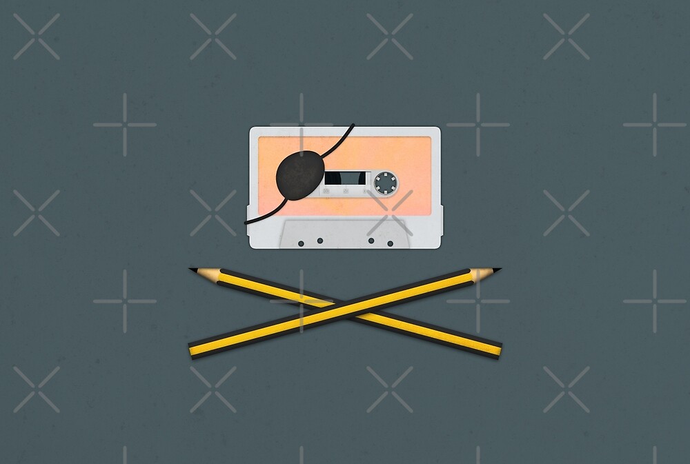
Audio pirate - remember this?
(linky link)
Friday, July 10, 2015
Lovey paper airplane.
Looking for a new cute case for your iPhone or Samsung Galaxy phone?
The design shows a figure throwing a paper airplane that followed an interesting flight path...
Design available also as prints for your wall and as a pillow in case you want to throw it to someone that might not be getting your message...
*Linky for RedBubble store
Sunday, February 8, 2015
Exploring Piero Manzoni - Qualities in a tin can.
The following are conceptual designs for tin cans (well... their labels at least), related to an international project on exploring Piero Manzoni's tin label art.
How would a tin can look like if it contained character qualities?
Logic. I guess often compared with being a know-it-all?
When not wanting to be called shallow. Layers and layers to peel off.
I think this one is pretty self explanatory.
I wanted to give love a try, but the idea i came up with was beyond the scope of this. I wanted to make a custom tin can shaped cylinder, that was made out of semitranslucent plastic (yeah, not tin) that was bulging out at the top and bottom, with light and heating elements inside to both light and warm it up.
How would a tin can look like if it contained character qualities?
Logic. I guess often compared with being a know-it-all?
When not wanting to be called shallow. Layers and layers to peel off.
I think this one is pretty self explanatory.
I wanted to give love a try, but the idea i came up with was beyond the scope of this. I wanted to make a custom tin can shaped cylinder, that was made out of semitranslucent plastic (yeah, not tin) that was bulging out at the top and bottom, with light and heating elements inside to both light and warm it up.
Friday, September 12, 2014
Design/graphics cheat #2 - Mobile gaming
Mobile gaming is all the rage now, and companies are showing their latest phones, tablets, phones the size of slippers and chipsets for 3D graphics on-the-go.
Everybody are now showing off some awesome looking shaders, effects and high polygon (for mobile) models making sure you realize that it's rendering in real time. There's something that they don't show a lot though and that's real time - level wide shadowing. And there's a good reason for it as well; it's probably one of the more resource intensive stuff to pull off well enough, so people making games are resorting to all sorts of trickery like "baking" lighting, drawing the details in the textures instead, using shadow "blobs" for stuff that's moving... in general cut using realtime shadows in mobile gaming as much as possible.
(It can be done of course, but most of the time you'd be better off faking it and pushing your savings on making the game run at more fps or implementing some more resources into your enemies.)
For things that are out in the open, what someone could do is mark areas with simple trigger boxes that are placed in shadowy areas. Then have a simple script that would smoothly make the texture of the object that enters the box's volume darker, and lighter as the object exits. A poor man's light probe if you like. These things do require tweaking though, but the plus is that your game's speed won't suffer and you'll get some nice looking stuff.
Everybody are now showing off some awesome looking shaders, effects and high polygon (for mobile) models making sure you realize that it's rendering in real time. There's something that they don't show a lot though and that's real time - level wide shadowing. And there's a good reason for it as well; it's probably one of the more resource intensive stuff to pull off well enough, so people making games are resorting to all sorts of trickery like "baking" lighting, drawing the details in the textures instead, using shadow "blobs" for stuff that's moving... in general cut using realtime shadows in mobile gaming as much as possible.
(It can be done of course, but most of the time you'd be better off faking it and pushing your savings on making the game run at more fps or implementing some more resources into your enemies.)
So where am i going with it?
Be smart in hiding things and using simple geometry to make shadows. Like the image on the right; those two things are just some of the obstacles in a game i'm trying to make that spew snow balls.
I really wanted to have some slight shadowing/ darkening effect in those barrels. Light mapping wouldn't work of course because ... that's not how it works... and real time shadowing would be no-no.
On a game you are trying to include as many devices as possible after-all to potentially have a larger install base. So it's back to old-school tricks, back to basics if you like. The barrels simply have 3 simple planes, with just 2 polygons each, and a simple black texture. Then the texture's alpha channel is set as semitransparent. Each plane will progressively make it look as if it's darker and darker the deeper you look. Of course this will only work for stuff that aren't out in the open.
For things that are out in the open, what someone could do is mark areas with simple trigger boxes that are placed in shadowy areas. Then have a simple script that would smoothly make the texture of the object that enters the box's volume darker, and lighter as the object exits. A poor man's light probe if you like. These things do require tweaking though, but the plus is that your game's speed won't suffer and you'll get some nice looking stuff.
Monday, June 10, 2013
Visual cues
Since we don't have radar or distance sensors embedded in our brains yet, we need to rely on our eyes and ears for cues on where something is, and this is even more important on video games since unless you use a 3D monitor, the view you are seeing is 2D. (Yes, even with 3D games. The monitor is still a flat 2D plane where everything is squashed into a single,flat view, so there goes your stereo vision)
So what can be done visually wise? Shadows someone might say. Well yeah, that is number one in the list but it's not just that. There are a couple things more that can be done in the levels themselves to show the spatial relationship of things. (Spatial relationship, bet that made me look smarter than what i am). Take a look at the image below for an example.
The image shows a level from a game that you have to stop the blue balls from falling in the pit, a pretty basic premise with no story behind it. The top part has the shadows disabled. It looks as if the balls are just pasted on top with little to tell you the distance from the ground at a glance and you don't really have time to observe because that thing is coming at you and you need to throw it back. The bottom half has the shadows enabled and the player can see exactly where on the playing field the ball is and how high.
But that's not the only cue. The pit is textured in a checkerboard like pattern. That makes it even easier to tell where the ball is going to be the in the future (since the balls fall towards the centre, you can use the pattern as a guide) and give you time to turn the paddle at that angle to throw the ball back. There is also a trail effect. That not only shows the general direction of the ball but also if the ball is going up or falling down, its angle and its speed.
(The shadow may look as if it's a bit ahead of the ball but actually it's right under it. The camera used is wide so it makes it look like that, a tiny bit - sort of - fisheyed).
P.S. Since this is for a mobile game, the shadows are not real time.The shading on the level and glove/paddle are baked (drawn) into the texture and the blob under the balls is from a script solution from Unity's Asset store.
So what can be done visually wise? Shadows someone might say. Well yeah, that is number one in the list but it's not just that. There are a couple things more that can be done in the levels themselves to show the spatial relationship of things. (Spatial relationship, bet that made me look smarter than what i am). Take a look at the image below for an example.
The image shows a level from a game that you have to stop the blue balls from falling in the pit, a pretty basic premise with no story behind it. The top part has the shadows disabled. It looks as if the balls are just pasted on top with little to tell you the distance from the ground at a glance and you don't really have time to observe because that thing is coming at you and you need to throw it back. The bottom half has the shadows enabled and the player can see exactly where on the playing field the ball is and how high.
But that's not the only cue. The pit is textured in a checkerboard like pattern. That makes it even easier to tell where the ball is going to be the in the future (since the balls fall towards the centre, you can use the pattern as a guide) and give you time to turn the paddle at that angle to throw the ball back. There is also a trail effect. That not only shows the general direction of the ball but also if the ball is going up or falling down, its angle and its speed.
(The shadow may look as if it's a bit ahead of the ball but actually it's right under it. The camera used is wide so it makes it look like that, a tiny bit - sort of - fisheyed).
P.S. Since this is for a mobile game, the shadows are not real time.The shading on the level and glove/paddle are baked (drawn) into the texture and the blob under the balls is from a script solution from Unity's Asset store.
Subscribe to:
Posts (Atom)